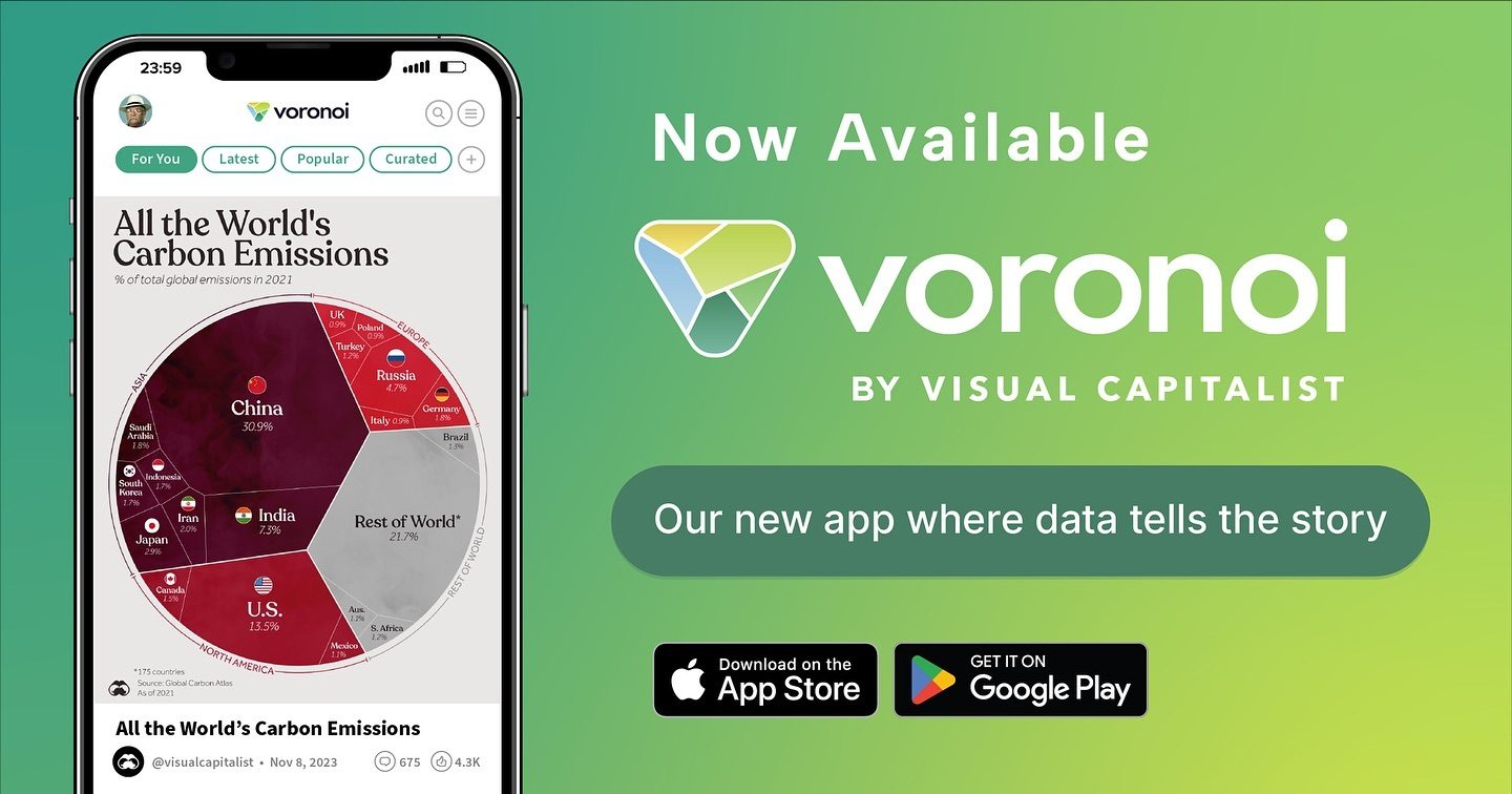
Carbon Emission Data Visualization
Understanding global carbon emissions is crucial for addressing climate change. The Voronoi app, a new tool for data storytelling, offers a compelling way to visualize and comprehend these emissions. The app presents a comprehensive data visualization that breaks down carbon emissions by country, providing insights into the world's top emitters.
Why This Matters
Carbon emissions are a significant contributor to global warming. By visualizing this data, we can better understand the impact of different countries and industries. This information is essential for policymakers, researchers, and environmental activists who work towards reducing carbon footprints and promoting sustainable practices. The Voronoi app, in collaboration with Visual Capitalist, provides a platform for these important data stories, making complex information accessible and engaging.
Data Storytelling with Voronoi
Exploring the Pie Chart
The app features a pie chart that meticulously details the percentage of carbon emissions from various countries. China, India, Russia, and the United States are prominently displayed, highlighting their substantial contributions to global emissions. This visualization helps in identifying key areas that need the most attention for emission reduction.
Unveiling the Carbon Emission Data
One of the standout features of Voronoi is its exclusive content from Visual Capitalist. This partnership ensures that users have access to high-quality, accurate data visualizations. The app not only displays emission data but also provides context and analysis, making it a comprehensive tool for understanding global carbon trends.
The Significance of the Voronoi App
Visual Capitalist Collaboration
The collaboration between Voronoi and Visual Capitalist brings together two leading forces in data storytelling. Visual Capitalist is renowned for its insightful and visually appealing data graphics, and Voronoi enhances this by making these visualizations accessible on mobile devices. This partnership ensures that users get the most reliable and engaging data visualizations available.
Beyond Carbon Emissions
While carbon emissions are a primary focus, the Voronoi app extends its coverage to a wide range of data topics. Users can explore various data stories, from economic trends to health statistics, all presented in an easy-to-understand format. This versatility makes Voronoi a valuable tool for anyone interested in data-driven insights.
Practical Tips for Using Voronoi
Getting Started
To begin your journey with the Voronoi app, download it from the App Store or Google Play. Once installed, you can explore a wealth of data visualizations, including the carbon emission data discussed. The app's intuitive interface ensures that even those new to data visualization can navigate and understand the information easily.
Navigating the App
The app's user-friendly design makes it simple to find the data you need. Use the search function to look for specific topics or browse through categories to explore different data stories. The visualization tools allow you to customize your view, making it easier to focus on the data that matters most to you.
Exclusive Content
One of the highlights of Voronoi is its exclusive content. Some visualizations are only available on the app, giving users an edge in accessing the latest and most accurate data stories. This exclusivity ensures that you stay informed with the most up-to-date information.
Important Takeaways
Understanding Global Emissions
The Voronoi app provides a clear and concise way to understand global carbon emissions. By breaking down the data into easily digestible visuals, it makes complex information accessible to everyone. This understanding is key for anyone involved in environmental conservation and sustainability efforts.
The Power of Data Visualization
Voronoi demonstrates the power of data visualization in making complex data understandable. The app's ability to present data in an engaging and informative manner is a testament to the effectiveness of visual storytelling in data science.
Accessing High-Quality Content
With its collaboration with Visual Capitalist, Voronoi ensures that users have access to high-quality content. This partnership guarantees that the data presented is accurate and reliable, making it a trusted source for data enthusiasts.
Engaging Users
The Voronoi app is not just about data; it's about storytelling. By presenting data in an engaging way, the app ensures that users remain interested and motivated to explore more. This engagement is crucial for retaining users and encouraging them to delve deeper into various data topics.
Conclusion
The Voronoi app, powered by collaboration with Visual Capitalist, offers a powerful tool for visualizing global carbon emissions and other important data topics. Its user-friendly interface, high-quality content, and exclusive visualizations make it an invaluable resource for anyone interested in data-driven insights. By providing a clear and engaging way to understand complex data, Voronoi helps individuals and organizations make informed decisions and contribute to a more sustainable future.
Watch the Reel
Questions readers ask
What makes the Voronoi app unique in tracking global carbon emissions data?
The Voronoi app stands out by offering a detailed breakdown of carbon emissions by country, making it easier to identify major contributors to global emissions. This feature allows users to gain specific insights rather than looking at aggregated global data.
How can the Voronoi app assist in reducing carbon footprints?
The app aids in reducing carbon footprints by providing clear, visual data on emissions. This helps policymakers, researchers, and activists understand which countries and industries are the biggest emitters, enabling them to target efforts more effectively. By pinpointing key areas, informed decisions can be made to implement sustainable practices.
Can the Voronoi app help users track their own carbon emissions?
Currently, the Voronoi app focuses on global and country-level emissions data. While it does not track individual carbon footprints, it empowers users to understand broader trends and contribute to discussions on reducing global emissions.
What are the key features of the Voronoi new app?
The Voronoi app offers a range of features, including comprehensive data visualization and detailed country-specific data. The app also provides insights into the world's top carbon emitters, making it a valuable tool for those looking to understand and address global emissions.
How frequently is the data in the Voronoi app updated?
The app is designed to provide up-to-date information, but the frequency of data updates can vary. Users should check the app's settings or help section for the most current information on data refresh rates.
Is the Voronoi app accessible to users worldwide?
Yes, the Voronoi app is designed to be accessible worldwide. Users from any country can download and use the app to explore global carbon emissions data and understand the impact of different regions on the environment.
Related deep dives
Similar reads based on topic and creator.


Recent articles
Fresh deep dives from the latest Reels we unpacked.




Comments
Be the first to comment.