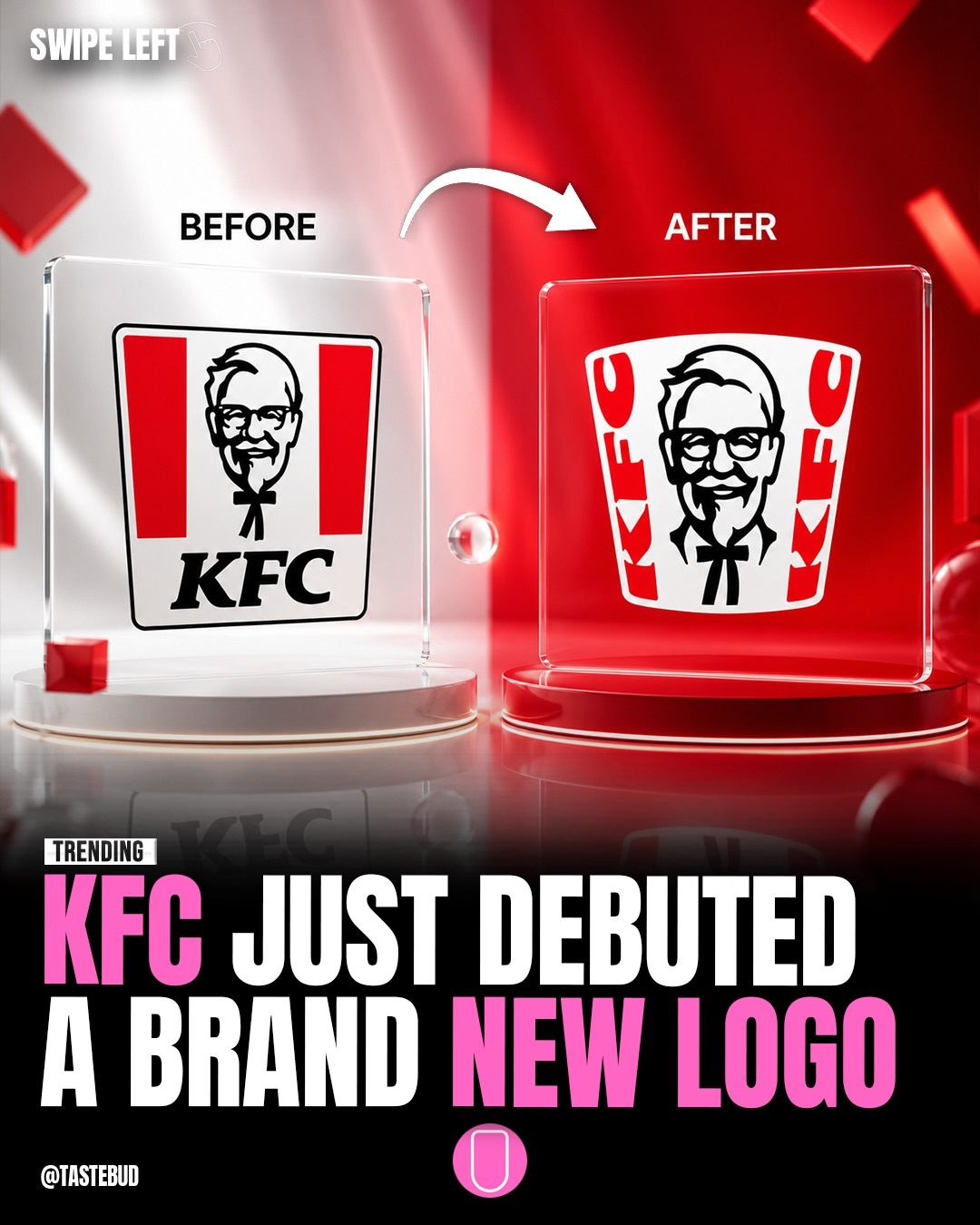
KFC Logo Evolution
The evolution of KFC's logo serves as a visual journey of the brand’s history. The iconic bucket, Colonel Sanders' likeness, and typography have all undergone transformations over the decades, reflecting societal and cultural shifts. The most recent update continues this tradition by refining the logo for a more modern feel, keeping it recognizable while introducing subtle improvements.
Context / Why this Matters
Logos are the cornerstone of a brand's identity, serving as a vital connection between the company and its customers. The evolution of KFC's logo showcases how a brand can adapt to changing times without losing its core identity. Each iteration of the logo reveals a fascinating story about the brand's journey, its growth, and the trends that have shaped its appearance.
Main Discussion
The Early Years: 1954 - 1978
The first KFC logo, introduced in 1954, featured the brand name "Kentucky Fried Chicken" prominently displayed in a simple, clear font. The design featured a straightforward layout with the company name written in bold letters. This early logo laid the groundwork for future designs, emphasizing the brand name and simplicity above all else.
By 1959, the logo underwent a subtle transformation. The design retained the original typography but added a more intricate border and color scheme. This change was subtle, reflecting the conservative design trends of the era, and aimed to give the brand a more professional look.
The 1970s - 1990s: Refining the Image
By 1978, the KFC logo began to incorporate a more playful and colorful design. The introduction of the Colonel Sanders' face within the logo marked a significant shift in branding. The logo featured a more modern, rounded look. This change aimed to make the brand more approachable and visually appealing to a wider audience.
From the 90s to the 2000s: Embracing Modernity
The 1991 redesign brought a more dynamic and vibrant look to the logo. The typography became bolder and more modern, reflecting the design trends of the time. The Colonel Sanders’ image was simplified, giving it a more contemporary feel. The logo also featured a more prominent use of red and white, highlighting the brand’s energetic and approachable personality.
The next major update in 1997 focused on enhancing the visual appeal and brand recognition. The Colonel's face was made more prominent, and the typography was refined. The color scheme remained consistent, with a stronger emphasis on the brand's primary colors. This iteration was designed to appeal to consumers who were increasingly seeking colorful and visually engaging branding.
The 2000s - 2021: Simplifying and Streamslining
The 2006 redesign brought a significant change, focusing on simplicity and clarity. The logo became more streamlined, with a cleaner and more modern look. The "Kentucky Fried Chicken" name was shortened to "KFC," and the typography was simplified. This change aimed to make the logo more versatile and recognizable in a global market.
The Modern Era: 2021 to Today
The recent logo redesign focuses on a cleaner Colonel Sanders, bolder typography, and a stronger emphasis on the iconic bucket. The subtle 3D touch gives it a more modern feel without losing the original identity. Instead of changing everything, KFC has upgraded what people already recognize, creating a logo that feels contemporary while retaining its classic elements.
Practical Tips
When Redesigning a Logo
- Understand Your Brand: Before making any changes, understand the core values and identity of your brand. KFC's recent redesign successfully retained the brand's essence while modernizing its look.
- Focus on Simplicity: Simplifying the design can make it more versatile and recognizable. The 2006 redesign of KFC’s logo exemplified this approach.
- Balancing Modernity and Tradition: Incorporate modern design elements without losing the traditional aspects that make your brand recognizable. KFC's recent update achieved this by introducing a 3D touch while retaining the iconic Colonel Sanders and bucket.
- Evolve, Don’t Reinvent: Instead of completely reinventing the logo, consider evolving it. KFC’s latest redesign shows how subtle changes can make a significant impact.
When Exploring Brand History
- Study the Timeline: Look at the timeline of logo changes to understand how the brand has evolved and adapted to different times. This can provide a wealth of information about the brand's journey and design choices.
- Focus on Key Elements: Pay attention to key elements such as typography, color schemes, and imagery. These elements often undergo subtle changes that reflect broader design trends and societal shifts.
Important Takeaways
- Brand Identity: A strong brand identity is crucial for maintaining customer recognition and loyalty. KFC’s logo evolution demonstrates how a brand can adapt and evolve without losing its core identity.
- Design Trends: Each iteration of the KFC logo reflects the design trends of its time. Studying these changes can provide valuable insights into the brand's history and the broader design landscape.
- Refinement Over Reinvention: KFC's latest redesign highlights the importance of refining a brand’s visual identity rather than completely reinventing it. This approach keeps the brand familiar to loyal customers while appealing to new audiences.
- Subtle Changes: Small, subtle changes can have a significant impact. The recent update to the KFC logo shows how minor adjustments can modernize a brand without losing its original charm.
Conclusion
The evolution of the KFC logo is a testament to the brand's ability to adapt and innovate while staying true to its roots. From the early days of "Kentucky Fried Chicken" to the current, modernized design, the logo has undergone numerous transformations, each reflecting the design trends and cultural shifts of its time. By focusing on refinement over reinvention, KFC has managed to create a logo that feels fresh and contemporary while remaining familiar and iconic. Understanding this evolution can provide valuable insights for anyone interested in branding and design.
Watch the Reel
Questions readers ask
When was the first KFC logo introduced and what did it feature?
The first KFC logo was introduced in 1954. It prominently featured the likeness of Colonel Sanders, the founder, and included a simple, clear font for the 'Kentucky Fried Chicken' text, along with a colon and a period.
What were the key changes in the 1959 KFC logo redesign?
In 1959, the KFC logo was revised to feature a more stylized portrait of Colonel Sanders. The font was changed to a more modern typeface, and the background color was altered to a golden yellow, giving the logo a more vibrant and eye-catching appearance.
What significant changes occurred in the 1991 KFC logo redesign?
The 1991 redesign brought about a more minimalist approach. The logo featured a simplified illustration of Colonel Sanders and a revised typeface. Additionally, the lettering was structured in a way to make the brand name clearer and more modern.
How did the 2006 update of the KFC logo differ from its predecessors?
The 2006 update focused on modernizing the logo. The illustration of Colonel Sanders was refined to a more contemporary style, and the text was simplified. The logo also introduced a more streamlined color palette, enhancing its visual appeal.
What was the 2018 redesign about?
The 2018 redesign aimed to simplify and modernize the logo. The Colonel Sanders illustration was rendered in a more stylized, clean-cut manner, and the text was modified to a bold, modern typeface. Additionally, the iconic bucket was introduced, symbolizing the brand's fried chicken heritage.
What can we expect from the next KFC logo redesign in 2026?
KFC hasn't released official details about the 2026 redesign, but based on past trends, it's likely to continue the tradition of modernizing and simplifying the logo. Expect a sleek, contemporary design that retains the brand's core identity and cultural relevance.
How has the KFC logo evolved to reflect cultural shifts?
Throughout its history, the KFC logo has evolved to stay relevant to societal and cultural changes. From the 1954 debut to the 2026 redesign, each iteration of the logo has adapted to reflect contemporary trends. The changes have been subtle, but the overall trajectory has been about keeping the brand recognizable and appealing to a diverse audience.
Related deep dives
Similar reads based on topic and creator.




Recent articles
Fresh deep dives from the latest Reels we unpacked.




Comments
Be the first to comment.