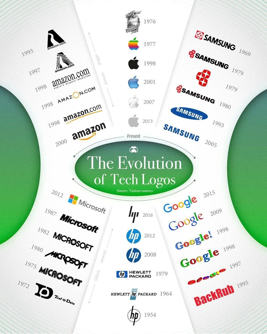
The Evolution of Tech Logos
Iconic tech companies have evolved over the decades, and their logos have transformed right along with them. Understanding this evolution offers insights into how these companies have grown and adapted to the ever-changing technological landscape.
Why This Matters
Logos are more than just a visual representation of a brand; they embody the company’s mission, values, and history. From innovative startups to technology giants, the logos of these companies have undergone significant changes that reflect their journey and growth. Analyzing these evolutions provides a fascinating perspective on how branding and design have adapted to technological advancements and market shifts.
Main Discussion
The Evolution of Amazon's Logo
Amazon’s journey from an online bookstore to a global e-commerce giant is reflected in its logo evolution. The original Amazon logo, which was a stylized "Amazon.com" text with a river flowing through it, highlighted the company’s initial focus on books. The river was a clever nod to the name Amazon, as the company aimed to be the "earth's largest bookstore."
With the company’s expansion into various product categories, the logo underwent several iterations. The current logo features a simple, streamlined design with the "Amazon" text and an arrow pointing from "a" to "z," symbolizing the company's vast product offerings. This evolution reflects Amazon's transformation from a niche bookstore to a comprehensive marketplace.
Microsoft's Branding Changes
Microsoft’s logo has also seen significant changes over the years. The first Microsoft logo, designed in 1975, was a simple text-based design with the company name in bold letters. This logo was used until 1979, when it was updated to include a more modern and sleek design.
The most notable change in Microsoft’s branding occurred in 2012, when the company introduced a flat, simplified logo. This new design featured a flat, square shape and vibrant colors, aligning with the trend of minimalist and modern design aesthetics. The current logo reflects Microsoft’s focus on simplicity, innovation, and user experience, a testament to the company’s evolution over the years.
Google's Transformation
Google’s logo evolution is a fascinating journey of a brand that started as "Backrub" and eventually became a household name. The initial Google logo, introduced in 1998, featured a simple, colorful design with the company name in bright colors. This playful logo was designed to reflect the company’s innovative and fun approach to search technology.
Over the years, Google has maintained its signature colorful design but has streamlined the logo to make it more versatile and recognizable. The current logo features a flat, modern design with clean typefaces, reflecting Google’s commitment to innovation and simplicity. The evolution of Google’s logo highlights the company’s ability to adapt to new technologies while maintaining its core values.
Apple's Logo Evolution
Apple’s logo is one of the most recognizable in the world, but it has undergone significant changes since its inception. The original Apple logo, designed in 1976, featured a detailed illustration of Isaac Newton sitting under a tree with an apple hanging over his head. This design was meant to symbolize the company’s focus on innovation and creativity.
The logo underwent several changes, including a rainbow-colored version, before settling on the iconic apple silhouette in 1998. This design, featuring a sleek, monochromatic look, has become synonymous with Apple’s focus on simplicity, elegance, and innovation. The evolution of Apple’s logo showcases the company’s ability to adapt to changing design trends while maintaining its core brand identity.
Samsung and HP's Logo Changes
Samsung and HP have also seen significant changes in their logos over the years. Samsung’s logo, which initially featured a stylized "S" with a circle, has evolved into a more modern and sleek design. The current logo, featuring a simple, bold font and a minimalist design, reflects Samsung’s focus on innovation and modern technology.
HP’s logo has undergone several iterations as well. The company’s first logo, introduced in 1939, featured a stylized "HP" text with a modern design. Over the years, the logo has evolved to reflect the company’s growth and focus on innovation. The current logo, featuring a sleek, modern design with a bold font, highlights HP’s commitment to cutting-edge technology and innovation.
Yahoo and IBM's Branding Journey
Yahoo’s logo evolution is also a notable example of branding changes. The original Yahoo logo, introduced in 1994, featured a colorful, playful design with the company name in bold, vibrant colors. This design was meant to reflect Yahoo’s fun and innovative approach to internet services.
Over the years, Yahoo’s logo has evolved to a more modern and streamlined design. The current logo, featuring a simple, bold font and a minimalist design, reflects Yahoo’s focus on simplicity and user experience, while maintaining its core brand values.
IBM, one of the oldest tech companies, has seen significant changes in its logo. The company’s original logo, introduced in 1911, featured a stylized "IBM" text with a modern design. Over the years, the logo has evolved to reflect IBM’s focus on innovation and technology.
Practical Tips
When designing a logo for a tech company, there are several practical tips to keep in mind:
- Reflect Core Values: Ensure that the logo reflects the company’s core values and mission.
- Simplify for Versatility: Opt for a simple, clean design that can be easily recognized and adapted across different platforms and mediums.
- Stay Timeless: Avoid trends that may quickly become outdated. Aim for a timeless design that can withstand the test of time.
- Evolve Gradually: Make gradual changes to the logo as the company evolves, rather than a complete overhaul.
Important Takeaways
The evolution of tech logos highlights the importance of adaptability in branding. These companies have successfully navigated changes in technology and market trends by updating their logos to reflect their growth and innovation. Key takeaways include:
- Adaptability: Logos should evolve to reflect the company’s growth and changes.
- Simplicity: Simple, clean designs are more versatile and timeless.
- Consistency: Maintain consistency in branding, even as logos evolve.
Conclusion
The journey of tech logos from their humble beginnings to their current forms is a testament to the adaptability and innovation of the companies behind them. From Amazon's expansion into various product categories to Microsoft’s streamlined branding, each evolution tells a story of growth, change, and success. Understanding this evolution provides valuable insights into the world of branding and design in the tech industry.
Watch the Reel
Questions readers ask
How has the Amazon logo adapted to the company’s growth over time?
The Amazon logo has undergone several changes since its inception. Initially, the logo featured a more traditional typography with a reference to a bookstore. As Amazon evolved into an all-encompassing marketplace, the logo simplified, featuring a stylized arrow beneath the text that subtly resembles a smile. This change reflects the company’s shift towards a more diverse range of products and services.
What inspired Microsoft’s shift to a more modern logo design?
Microsoft’s logo redesign was aimed at reflecting the company’s move towards a sleek, modern aesthetic. The new design features a flatter, more streamlined look, and the Windows 'Metro' style is used throughout. This change aligns with Microsoft's focus on simplifying user interfaces and enhancing user experience across their platforms.
How many times has the Google logo changed since its launch?
The Google logo has seen several modifications since its launch. Initially featuring a more playful, hand-drawn design, the logo has been updated to reflect a cleaner, more professional look. The color palette remains consistent, but the typography and design elements have evolved to represent Google's growth and diversification into various technology sectors.
What does the evolution of the Apple logo tell us about the company’s branding strategy?
Apple’s logo has undergone significant changes, from its original rainbow-colored apple with a bite taken out to the sleek, monochromatic design used today. This evolution mirrors Apple's transition from a niche computer company to a global leader in technology, emphasizing simplicity and elegance in design, which is reflected in their products as well.
How does Samsung’s logo reflect its expansion into consumer electronics?
Samsung’s logo has transitioned from a complex design with multiple elements to a more streamlined, modern look. The current design features a stylized, minimalist 'S' and is often used in a sleek, metallic finish. This change reflects Samsung's shift from a small-scale electronics producer to a leading innovator in consumer electronics and technology.
Related deep dives
Similar reads based on topic and creator.


Recent articles
Fresh deep dives from the latest Reels we unpacked.




Comments
Be the first to comment.