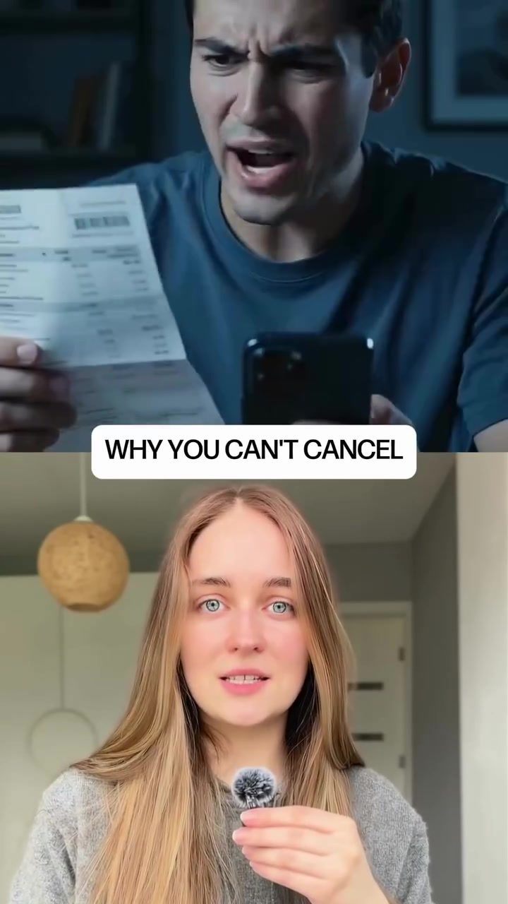
Subscription Cancellation Struggles
Ever tried to cancel a subscription and found yourself stuck in a labyrinth of menus, cursing at your screen because the cancel button is nowhere to be found? This is a common frustration many users face, and it's no accident. Companies employ various psychological tricks to make the cancellation process as difficult as possible. This phenomenon is part of what is known as the "Dark Side of UX" — a term that refers to the deceptive design practices used to trap users into staying subscribed.
Why This Matters
Understanding these tactics is crucial for anyone who uses mobile apps or online services. By recognizing the strategies employed to frustrate the cancellation process, users can navigate these hurdles more effectively. Moreover, being aware of these practices can help users make more informed decisions about the services they subscribe to, ensuring they are not unwittingly locked into long-term commitments.
The Dark Side of UX
The tactics used to frustrate users during the cancellation process are often subtle but highly effective. Here are some of the key techniques:
Hiding the Cancel Button
One of the most common tactics is to hide the cancel button. It might be tucked away in a menu, buried at the bottom of a settings page, or made to look like a non-clickable element. The idea is to add enough friction to outlast the user's willpower. Every extra step is a chance for you to give up, and companies know the drop-off math — the likelihood of users abandoning the process at each step.
The "Take a Break" Screen
Once you've managed to find the cancel button, the next hurdle is often a "take a break" screen. This screen encourages you to pause your subscription for a month or two instead of canceling it. The pause button is big and bright, making it the more obvious choice. The continue to cancel option is often small, barely clickable, and easy to miss. This tactic is particularly effective for services like food delivery or class passes, where users might convince themselves they might come back.
If you manage to bypass the "take a break" screen, you might be presented with your billing history. Companies use this information to manipulate your emotions. Seeing a long list of past transactions can make you feel like you're throwing something away, making it harder to follow through with the cancellation.
Psychological Tricks in Action
The tactics employed during the cancellation process are rooted in behavioral psychology. Here are a few key psychological principles at play:
The Endowment Effect
The endowment effect refers to the tendency for people to overvalue things simply because they own them. When you see your billing history or past usage data, it can make you feel like you're losing something valuable. This emotional attachment can make it harder to go through with the cancellation.
Cognitive Overload
Cognitive overload occurs when the brain is bombarded with too much information at once. The more steps and choices you have to make during the cancellation process, the more likely you are to give up. Companies know this and design their cancellation processes to be as confusing and overwhelming as possible.
Practical Tips
To navigate these psychological barriers, consider the following tips:
-
Stay Motivated: Before starting the cancellation process, remind yourself why you want to cancel. Keep that motivation in mind as you go through the steps.
-
Be Patient: Expect the process to be frustrating and time-consuming. Set aside enough time to complete the cancellation without rushing.
-
Read Carefully: Pay close attention to the buttons and options presented to you. Look for small, non-obvious buttons that might be the actual cancel option.
-
Use a Support Chat: If all else fails, use the support chat or call the customer service line. Sometimes, speaking to a person can help you bypass the digital hurdles.
-
Document the Process: Take screenshots or notes of the steps you take. This can be useful if you need to contact customer support or file a complaint.
Important Takeaways
-
Acknowledge the Tricks: Recognize that companies are using psychological tricks to keep you subscribed. Being aware of these tactics can help you stay focused on your goal.
-
Stay Determined: Remember that every step in the process is designed to make you give up. Stay determined and keep going until you've completed the cancellation.
-
Seek Alternatives: If you find the cancellation process too frustrating, consider pausing the subscription instead. This can give you a break without requiring a complete cancellation, which can be easier to manage.
-
Support and Feedback: Use customer support and feedback mechanisms to inform the company about your experience. Your feedback can help them improve their services and make the cancellation process more user-friendly.
Conclusion
The psychological tricks used in the cancellation process are designed to exploit low motivation and high frustration. By understanding these tactics and being prepared for the hurdles, you can navigate the cancellation process more effectively. Whether you're dealing with a food delivery service, a class pass, or any other subscription, knowing what to expect can make the process less daunting. Stay motivated, be patient, and don't let the psychological barriers stand in your way.
Watch the Reel
Questions readers ask
What are dark patterns in UX and how do they affect subscription cancellation?
Dark patterns in UX are design tactics used to trick users into taking actions they might not otherwise take, such as making it difficult to cancel a subscription. These patterns can lead to frustration and confusion, making users feel trapped in services they no longer want or need.
Why is the cancel subscription button often hard to find?
Companies may hide the cancel subscription button to discourage users from leaving. This tactic is a common dark pattern used to retain customers, even if they are no longer satisfied with the service. Users might find the button buried in menus or disguised as another option.
What are some psychological tricks used to make subscription cancellation difficult?
Companies often employ tactics like asking for feedback before allowing cancellation or offering alternative options, such as downgrading the subscription. These tactics are designed to create a sense of guilt or make users reconsider their decision, thereby increasing the likelihood they will stay subscribed.
Why do some services offer a pause option instead of a cancellation?
A pause option allows users to temporarily halt their subscription without fully cancelling it, which can be convenient for short-term breaks. However, this option is also a tactic to keep users engaged with the service, making it easier for companies to reactivate the subscription later and continue billing.
What are some common subscription traps to be aware of?
Subscription traps can include automatic renewals, hidden fees, and complex cancellation processes. These traps are designed to lock users into long-term commitments, making it difficult for them to exit the service if they are no longer satisfied.
How can users navigate the Dark Side of UX more effectively?
Users can start by being mindful of the strategies employed to frustrate the cancellation process. This includes actively searching for the cancel subscription button, taking time to read through terms and conditions, and considering alternative services that prioritize user experience and transparency.
Related deep dives
Similar reads based on topic and creator.




Recent articles
Fresh deep dives from the latest Reels we unpacked.



Comments
Be the first to comment.