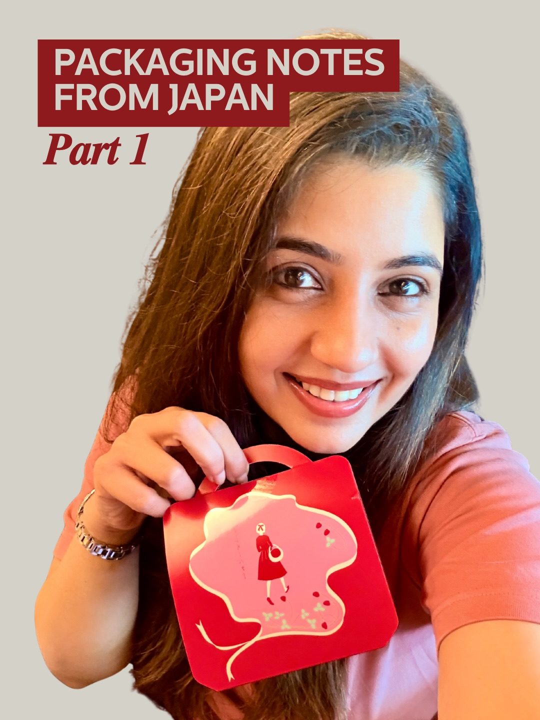
Packaging Notes from Japan
Japanese packaging is renowned for its understated elegance and functional design. Walking through the shelves in Japan, one notices how packaging is designed to be both unassuming and confident. This approach contrasts sharply with the loud, attention-grabbing designs prevalent elsewhere. Japanese packaging often relies on form, spacing, and color to convey its message, avoiding the need to shout for attention.
Why This Matters
The design philosophy behind Japanese packaging offers valuable insights into effective branding and visual communication. By focusing on subtle yet impactful elements, these designs demonstrate a mastery of minimalism and clarity. This approach isn't just about aesthetics; it's about creating a lasting impression through thoughtful design choices.
Japanese Packaging Design Principles
Minimalism and Clarity
Japanese packaging often embodies a minimalist design ethos. This is evident in the way products like Golden Mustard use typography to convey their message effectively. The label of Golden Mustard, made in Japan, showcases a minimalist approach where the design lets the type do the heavy lifting. This approach ensures that the product's essence is communicated without unnecessary distractions.
Use of Color
Color plays a crucial role in Japanese packaging design. The red envelope featured at the beginning of this exploration exemplifies how a single color can be used to create a strong visual impact. This design choice effectively uses color to grab attention without overpowering the overall aesthetic. The red color block design of Calorie Mate, a food product, is another example of how a confident color choice can be both functional and aesthetically pleasing. This color block design does its job by standing out while remaining simple and uncluttered.
Typography and Spacing
Typography and spacing are key design elements in Japanese packaging. Golden Mustard's packaging demonstrates how clear and well-placed text can make a product stand out. The text is not only visually pleasing but also conveys the necessary information without overwhelming the viewer. This minimalist approach to typography and spacing ensures that the product is clear and easy to understand, adhering to the Japanese design philosophy of simplicity and functionality.
Case Studies: Key Products
Golden Mustard
Golden Mustard, a popular food product from Japan, exemplifies the principles of minimalist design. The jar features a clean, uncluttered label with a focus on typography. The design lets the type communicate the product's name and key information, ensuring that the packaging is both functional and visually appealing. This approach to design is about letting the product speak for itself, relying on clarity and simplicity to make a strong impression.
Calorie Mate Block
Calorie Mate Block is another product that showcases the effectiveness of minimalist design. The design features a confident color block that immediately grabs attention without any unnecessary garnish. This design approach ensures that the product stands out on the shelf, making it easily recognizable and memorable. The color block design is not just aesthetically pleasing; it also serves a functional purpose by clearly communicating the product's identity.
Red Color Block Design
The solid red color block featured in this exploration is a great example of design inspiration. The simplicity and confidence of this design element make it a versatile choice for various projects. The red color block is a powerful way to grab attention and create a strong visual impact. By keeping the design minimal and focused, this approach ensures that the message is clear and memorable.
Practical Tips for Effective Packaging Design
Embrace Minimalism
Adopt a minimalist approach to your packaging design. Focus on clear typography, appropriate spacing, and a confident color choice. This approach ensures that your product stands out without overwhelming the viewer.
Simplify Your Message
Ensure that your packaging communicates the product's message clearly and concisely. Avoid clutter and unnecessary distractions. Let the typography and design elements work together to convey the product's essence.
Use Color Wisely
Choose colors that complement your product and brand. A confident color choice can make a strong visual impact and enhance the overall aesthetic of your packaging. Ensure that the color choice is functional and serves a purpose in the overall design.
Highlight Key Elements
Identify the key elements of your product and highlight them in your packaging design. This ensures that the product's unique features are easily recognizable and memorable.
Important Takeaways
Japanese packaging design offers valuable lessons in minimalism and clarity. By focusing on form, spacing, and color, designers can create packaging that is both functional and visually appealing. The key takeaways from this exploration include the importance of minimalist design, the effective use of typography and spacing, and the power of color in creating a strong visual impact.
Conclusion
Packaging design in Japan serves as a masterclass in minimalism and clarity. From the unassuming yet confident design of Golden Mustard to the powerful use of color and typography in Calorie Mate Block, these products demonstrate the effectiveness of a well-executed minimalist design approach. By embracing these principles, designers can create packaging that stands out, communicates clearly, and leaves a lasting impression.
Designing packaging that captures the essence of Japanese minimalist design is about more than just aesthetics; it's about creating a product that communicates effectively and stands out on the shelf. By following these principles, you can elevate your packaging design to new heights, making your product both functional and visually appealing.
Watch the Reel
Questions readers ask
What makes Japanese packaging design unique compared to other design styles?
Japanese packaging design stands out due to its understated elegance and minimalist approach. Unlike other styles that often rely on loud colors and busy designs, Japanese packaging focuses on form, color, and typography to make a statement without being overbearing.
How does the use of color contribute to the effectiveness of Japanese packaging?
Color in Japanese packaging is used strategically to evoke emotions and convey messages subtly. The color palette is often muted and harmonious, which helps to create a calm and sophisticated aesthetic, making the packaging appealing to consumers.
What role does typography play in Japanese packaging design?
Typography in Japanese packaging is meticulously chosen to enhance the overall design. Clean, simple fonts are often used to ensure readability and to maintain the minimalist aesthetic. The typography is carefully integrated with the visuals to create a cohesive and impactful design.
Why is the form or shape of Japanese packaging so important?
The form of Japanese packaging is crucial because it serves both functional and aesthetic purposes. The design often emphasizes practicality, ensuring the product is well-protected, while also incorporating subtle, elegant shapes that make the packaging visually appealing.
How can brands outside of Japan benefit from studying Japanese packaging design?
Brands can gain valuable insights into creating bold yet unassuming packaging by studying Japanese design philosophy. This approach can help in creating packaging that stands out without being flashy, offering a unique and memorable experience for consumers.
What are some key design elements to consider when creating minimalist packaging?
Key elements include the use of negative space, a focus on form and shape, and a minimal color palette. Additionally, typography should be clean and simple, and the overall design should aim to convey its message without relying on excessive decorations.
How does Japanese packaging design approach the balance between simplicity and impact?
Japanese packaging design achieves this balance by using subtle, elegant designs that make a strong impression. The focus is on the quality of the elements used rather than the quantity, ensuring that every part of the packaging serves a purpose and contributes to the overall aesthetic.
Recent articles
Fresh deep dives from the latest Reels we unpacked.




Comments
Be the first to comment.