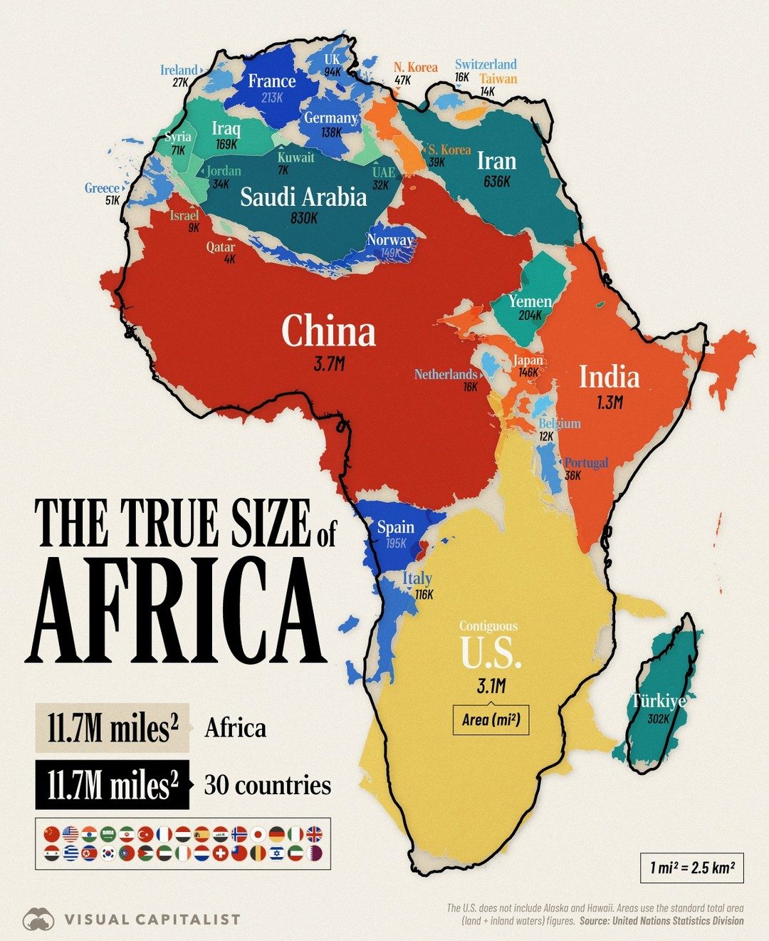
Africa's True Size
Africa's true size is often underestimated by many people, as the common Mercator map projection distorts the actual dimensions of continents. Africa is the world's second-largest continent, covering an impressive 11.7 million square miles (30.4 million square kilometers). Understanding Africa's true size compared to other nations provides valuable insights into the continent’s geography and its significance on the global stage.
Why This Matters
The misperception of Africa's size can lead to misunderstandings about its economic, cultural, and environmental importance. By accurately visualizing Africa's dimensions, we can gain a clearer picture of its role in global contexts, such as climate change, resource distribution, and international relations. This understanding helps in making informed decisions about Africa's development and its place in the world.
Main Discussion
The Distortion of the Mercator Map
The Mercator map projection, which is widely used in classrooms and media, greatly distorts the size of continents and countries. Developed in the 16th century, the Mercator map is valuable for navigation because it represents lines of constant course, or rhumb lines, as straight segments that converge at the poles. However, it significantly exaggerates the size of countries closer to the poles, such as Europe and North America, while shrinking those near the equator, including Africa and South America.
This distortion can lead to a skewed perception of Africa's size. For example, the Mercator map makes Greenland appear to be about the same size as Africa, when in reality, Africa is approximately 14 times larger. This distortion has profound implications for how we perceive and interact with different parts of the world.
Africa's Actual Size
Africa is so vast that it can accommodate several major countries. If you were to overlay the boundaries of the U.S., China, India, and much of Western Europe onto Africa, they would all fit within its boundaries. This visual comparison highlights the staggering scale of the continent.
Comparing Africa to Other Countries
Let us delve deeper into these comparisons:
-
United States: The U.S. (excluding Alaska and Hawaii) covers around 3.8 million square miles (9.8 million square kilometers). Africa, at 11.7 million square miles, is roughly three times larger.
-
China: China spans approximately 3.7 million square miles (9.6 million square kilometers). Africa is more than triple the size of China.
-
India: India covers about 1.3 million square miles (3.3 million square kilometers), making Africa nearly nine times larger.
-
Western Europe: The combined area of major Western European countries, including France, Germany, Italy, Spain, and the United Kingdom, is roughly 2.1 million square miles (5.4 million square kilometers). Africa can comfortably accommodate this region several times over.
Visualizing Africa's Size
Infographics and visual representations are powerful tools for conveying the true scale of continents. These visual aids help to overcome the limitations of traditional maps. By resizing countries to reflect their actual areas, we can better grasp the magnitude of Africa's landmass.
For instance, an infographic might show Africa and all the countries it could fit inside. This method visually underscores the vastness of Africa and challenges the distorted perceptions reinforced by traditional maps. The United Nations Statistics Division provides reliable data for such visualizations, ensuring accuracy and credibility.
Practical Tips
Visualizing Africa's size can be a practical exercise in geography and data representation. Here are some tips for creating your own visual aids to illustrate Africa's true dimensions:
-
Use Accurate Data: Ensure that the data you use comes from reliable sources, such as the United Nations Statistics Division. Correct data is crucial for accurate representations.
-
Choose the Right Projection: Opt for maps that use projections like the Gall-Peters or the Winkel tripel, which provide a more accurate representation of land areas compared to the Mercator projection.
-
Create Interactive Maps: Interactive maps can be more engaging and educational. Tools like Tableau or Google Maps can help create maps that allow users to explore and compare sizes more effectively.
-
Compare with Familiar Lands: Compare Africa to familiar lands that people are more acquainted with, such as the United States or Europe. This can make the scale of Africa more relatable and easier to understand.
-
Incorporate Real-World Examples: Use real-world examples, such as the number of countries that could fit inside Africa, to drive home the point about its size.
Important Takeaways
Understanding Africa's true size is essential for a balanced and accurate view of the world. By recognizing the distortions in common map projections, we can better appreciate the continent’s significance. Here are the key takeaways:
- Africa is the second-largest continent, covering 11.7 million square miles (30.4 million square kilometers).
- Traditional maps, like the Mercator projection, significantly underestimate Africa's size.
- Visual aids and accurate data are crucial for conveying the true dimensions of Africa.
- Africa’s vastness has significant implications for global issues, including climate change, resource distribution, and international relations.
Conclusion
Africa's true size is a testament to its geographical and cultural significance. By recognizing and correcting the distortions in traditional maps, we can gain a more accurate and comprehensive understanding of the continent. This knowledge is not just about geography; it shapes our perceptions, policies, and interactions with Africa and its people. Embracing a true understanding of Africa’s size is a step toward a more informed and balanced view of the world.
Watch the Reel
Questions readers ask
Why does the Mercator map projection distort Africa's size?
The Mercator map projection distorts Africa's size because it represents the spherical Earth on a flat surface. This causes areas near the poles to appear larger than they actually are, while areas near the equator, like Africa, seem smaller. The Mercator map is useful for navigation but not for accurately depicting landmass size or shape.
How much larger is Africa compared to other continents?
Africa is about 30% larger than South America, 3 times the size of the United States, and about 1.5 times the size of China. It is the world's second-largest continent, covering about 11.7 million square miles (30.4 million square kilometers) or 20.4% of the Earth's total land area.
How does Africa's size compare to Europe?
Africa is approximately 3.5 times larger than Europe. Europe covers about 3.9 million square miles (10.1 million square kilometers), while Africa covers about 11.7 million square miles (30.4 million square kilometers). Europe’s 10-15 countries roughly fit into Africa.
What are the largest countries in Africa by size?
The largest countries in Africa by size are Algeria, the Democratic Republic of the Congo, and Sudan. Algeria is the largest, covering about 919,595 square miles (2,381,741 square kilometers), followed by the Democratic Republic of the Congo at approximately 905,355 square miles (2,344,858 square kilometers) and Sudan at around 718,723 square miles (1,861,435 square kilometers).
How does Africa's size impact its role in international relations?
Africa's size makes it crucial in international relations due to its significant landmass and rich resources. The continent's vast territory plays a key role in global climate discussions, resource distribution, and geopolitical strategies. Its large population and diverse cultures also contribute to its influence on the world stage.
Why is it important to understand Africa's true dimensions?
Understanding Africa's true dimensions is important for gaining a realistic perspective on its global significance. It challenges misconceptions and helps in appreciating Africa's role in areas like resource distribution, climate change, and international relations. This knowledge can foster better decision-making and relations with other countries.
How can I visualize the true size of Africa?
To visualize the true size of Africa, you can use alternative map projections like the Gall-Peters or the Authagraph map. These projections provide a more accurate representation of the continent's size in relation to other landmasses. Online tools and interactive maps can also help in understanding Africa's true dimensions compared to other continents and countries.
Related deep dives
Similar reads based on topic and creator.


Recent articles
Fresh deep dives from the latest Reels we unpacked.




Comments
Be the first to comment.