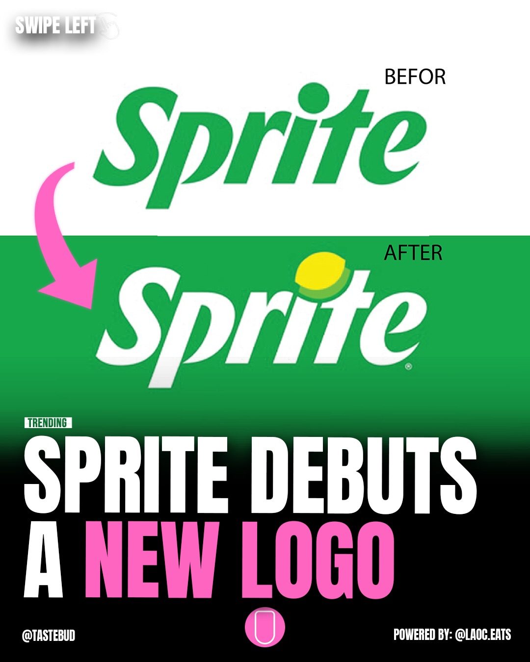
Sprite Logo Evolution
Sprite, a household name in the soft drink world, has recently unveiled a refreshed brand identity. The redesign not only introduces a brighter green and white color palette but also brings back a classic element—the “Lymon” symbol. Alongside this visual update, Sprite has launched a new sonic identity called “Sprite Sound” in collaboration with producer Mustard. The brand aims to stand out more both in stores and online with these changes. Let's dive into the details of this exciting transformation.
Context / Why this matters
In today's competitive beverage market, brand identity plays a crucial role in differentiating products and capturing consumer attention. Sprite's logo redesign is part of a broader strategy to revitalize its image and appeal to a new generation of consumers. By modernizing its visual and auditory identities, Sprite seeks to enhance brand recognition and create a more dynamic presence in the market.
Main discussion
The Evolution of the Sprite Logo
The evolution of the Sprite logo reflects the brand's journey over the years, adapting to changing times and consumer preferences. The new design signifies a shift towards a more vibrant and contemporary aesthetic, while still paying homage to its heritage.
Old vs. New: A Fresh Look
The old Sprite logo, characterized by a more subdued green and white color scheme, has been a familiar sight for decades. The new logo, however, features a brighter and more eye-catching palette. This change is intended to make the brand stand out more prominently on store shelves and digital platforms.
The new design also reintroduces the classic “Lymon” symbol, a nostalgic touch that evokes memories of the brand’s history. This element is strategically integrated into the modern design, creating a harmonious blend of the past and the present.
Vertical Wordmark and Enhanced Visibility
One of the most noticeable changes in the new logo is the introduction of a vertical wordmark on cans. This alteration enhances the visibility and legibility of the Sprite branding, particularly in crowded retail environments. The vertical orientation ensures that the brand name is easily readable from a distance, making it more recognizable to consumers.
Sonic Identity: Introducing Sprite Sound
To complement its visual makeover, Sprite has launched a new sonic identity called “Sprite Sound.” This audio branding, created in collaboration with producer Mustard, aims to create a unique and memorable auditory experience for consumers. Sonic branding is an often overlooked aspect of a brand's identity, but it plays a crucial role in building brand recall and emotional connection.
By introducing “Sprite Sound,” the brand aims to create a cohesive and immersive experience that spans both visual and auditory senses. This innovative approach helps Sprite stand out in a crowded market and fosters a deeper connection with its audience.
Practical tips
Designing for Visibility
When designing or redesigning a brand, visibility is key. Consider the following tips to ensure your brand stands out:
- Color Palette: Choose a color palette that is vibrant and attention-grabbing. Bright colors can help your brand stand out in a crowded market.
- Legibility: Ensure that your brand name and logo are easily readable from a distance. Vertical wordmarks, like the one used by Sprite, can enhance legibility.
- Consistency: Maintain consistency across all touchpoints, from packaging to digital platforms. A cohesive brand identity helps build recognition and trust.
Engaging with Audio
Sonic branding is an effective way to create a unique and memorable experience for your audience. Here are some tips to get started:
- Collaborate with Professionals: Work with experienced producers and sound designers to create a sonic identity that perfectly represents your brand.
- Consistency is Key: Use your sonic identity consistently across all channels, from television commercials to social media posts. This helps build brand recall and familiarity.
- Emotion and Connection: Incorporate elements that evoke emotions and create a deeper connection with your audience. Music and sound effects can evoke powerful memories and feelings.
Important takeaways
- Visual and Sonic Branding: Sprite's redesign demonstrates the importance of both visual and sonic branding in creating a cohesive and memorable brand identity.
- Balance of Tradition and Innovation: The inclusion of the classic “Lymon” symbol shows how brands can balance tradition with innovation to create a timeless yet modern identity.
- Visibility and Legibility: Enhancing visibility and legibility through design choices, like a vertical wordmark, can significantly impact brand recognition.
Conclusion
Sprite's refreshed brand identity marks an exciting chapter in the brand's history. By embracing a brighter color palette, reintroducing the classic “Lymon” symbol, and launching a new sonic identity, Sprite aims to stand out in a competitive market. The redesign is a testament to the power of strategic branding in enhancing brand recognition and consumer engagement. As Sprite continues to innovate, it sets a benchmark for other brands seeking to revitalize their identities in the ever-evolving beverage industry.
Watch the Reel
Questions readers ask
What are the key changes in Sprite's new logo?
The new Sprite logo features a brighter green and white color scheme, which replaces the previous color palette. Additionally, the nostalgic “Lymon” symbol has been reincorporated into the design to evoke a sense of familiarity and tradition.
Why has Sprite decided to update its logo?
Sprite aims to boost its visibility and appeal to a younger generation of consumers. The update is part of a broader strategy to revitalize the brand's image in an increasingly competitive beverage market.
What is the significance of the 'Lymon' symbol in the new logo?
The 'Lymon' symbol is a nostalgic element that brings a sense of heritage and familiarity to the new logo. Its return is intended to remind consumers of Sprite's classic branding while also making the brand more recognizable.
How does the new color palette differentiate Sprite from competitors?
The brighter green and white color scheme is designed to make Sprite stand out more prominently on store shelves and in digital spaces. This vibrant palette helps to create a modern and eye-catching visual identity.
What other changes have been made to the Sprite brand besides the logo redesign?
In addition to the logo refresh, Sprite has introduced a new sonic identity called 'Sprite Sound' in collaboration with producer Mustard. This audio element further enhances the brand's overall appeal and recognition.
How does Sprite plan to leverage its new brand identity in the beverage market?
Sprite intends to utilize its refreshed brand identity to improve its visibility and attract new consumers. The modernized logo and sonic identity are part of a comprehensive strategy to differentiate Sprite in the competitive beverage market.
Related deep dives
Similar reads based on topic and creator.


Recent articles
Fresh deep dives from the latest Reels we unpacked.



Comments
Be the first to comment.