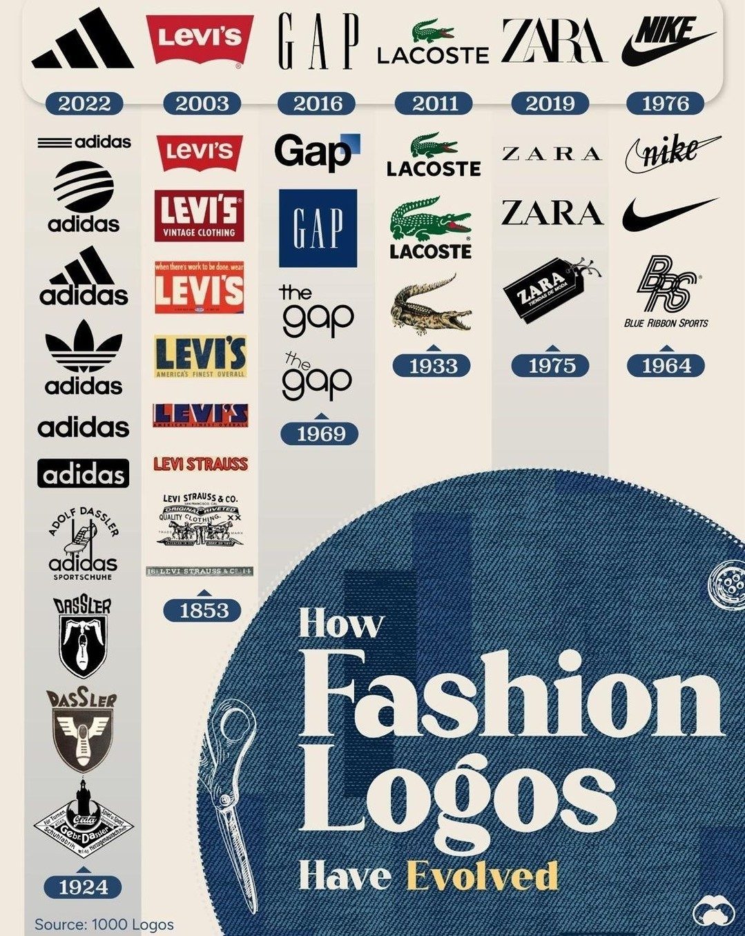
Fashion Logo Evolution: A Journey Through Iconic Brand Transformations
Fashion logos are more than just symbols; they are visual representations of a brand's journey, values, and evolution. Let’s explore the fascinating journey of six iconic fashion brands and how their logos have changed over time.
Why This Matters
In the ever-evolving world of fashion, brand identity is crucial. Logos serve as the face of a brand, conveying its essence and history. Understanding the evolution of fashion logos provides insights into the broader trends and shifts in the industry. It also highlights the importance of adaptability and innovation in maintaining relevance in a competitive market.
Main Discussion
Adidas: From Dassler Brothers to Global Icon
Adidas, originally founded in the 1920s in Germany by Adolf Dassler, has undergone significant transformations. The initial logo featured the name "Dassler" in bold, block letters, reflecting the brand’s straightforward and functional origins. Over the years, the logo evolved, incorporating elements like the three stripes, which became synonymous with the brand. Today, the adidas logo is sleek and modern, with a stylized, minimalist design that resonates with a global audience.
One significant change occurred in 2022, where the brand adopted a more minimalist and versatile design. This shift reflects the brand’s focus on simplicity and adaptability in a rapidly changing market.
Levi’s: The Evolution of Denim Iconography
Levi’s, known for its iconic denim jeans, has a logo that tells a story of American heritage and innovation. The brand’s first logo, used in the 1930s, featured the name "Levi Strauss & Co." in a classic, serif font, often accompanied by images of denim garments. Over time, the logo has simplified, with the iconic red tab and “Levi’s” name becoming the primary identifiers.
The vintage overall logo, “Americas Finest Overall,” is a testament to the brand’s enduring appeal and commitment to quality. The evolution of Levi’s logo highlights the brand’s ability to stay relevant while honoring its roots.
Nike: From Blue Ribbon Sports to Global Dominance
Nike, the world’s largest footwear company, underwent a significant transformation from its days as Blue Ribbon Sports. The initial Nike logo, designed in 1971 by Carolyn Davidson, featured a more intricate “Swoosh” design. Over time, the logo has simplified, with the Swoosh becoming a universally recognized symbol of athletic excellence and innovation.
One of the most memorable changes occurred in 1976, where the logo adopted a more streamlined and modern design, reflecting the brand’s commitment to innovation. Today, the Nike logo is a testament to the brand’s global dominance and leadership in the athletic apparel industry.
Gap: Simplicity and Timelessness
The Gap, established in 1969, has a logo that embodies simplicity and timelessness. The initial Gap logo featured a bold, block font with the name "The Gap" prominently displayed. Over the years, the logo has evolved, with the brand adopting a more minimalist design in 1985, featuring just the name "Gap" in a clean, sans-serif font.
The evolution of the Gap logo reflects the brand’s commitment to simplicity and timelessness, with a design that has remained largely unchanged for decades.
Lacoste: The Classic Alligator
Lacoste, known for its iconic polo shirts and the alligator logo, has a logo that is instantly recognizable. The initial Lacoste logo, designed in the 1930s, featured a simple, stitched alligator. Over time, the logo has remained largely unchanged, with the alligator becoming a symbol of luxury and elegance.
The Lacoste logo is a testament to the brand’s enduring appeal and commitment to classic design.
Zara: Modern Simplicity
Zara, a Spanish clothing and accessories retailer, has a logo that reflects modern simplicity and elegance. The initial Zara logo featured a bold, block font with the name "Zara" prominently displayed. Over time, the logo has evolved, with the brand adopting a more minimalist design, featuring the name "Zara" in a sleek, sans-serif font.
The evolution of the Zara logo reflects the brand’s commitment to modern, minimalist design and its focus on staying relevant in a competitive market.
Practical Tips
When creating or updating a fashion brand logo, consider the following tips:
- Simplicity: Aim for a design that is simple, clean, and easy to remember.
- Timelessness: Ensure that the logo has a timeless appeal and can withstand the test of time.
- Adaptability: Design a logo that can adapt to various mediums and platforms, from apparel to digital media.
- Emotional Connection: Create a logo that evokes an emotional connection with your audience, reflecting the brand’s values and identity.
Important Takeaways
The evolution of fashion logos offers valuable insights into the industry’s history, trends, and shifts. Key takeaways include:
- Adaptability: Successful fashion brands continually adapt their logos to stay relevant in a changing market.
- Simplicity: Simplicity and minimalism are key to creating a timeless and recognizable logo.
- Emotional Connection: A logo should evoke an emotional connection with the audience, reflecting the brand’s values and identity.
Conclusion
The journey of fashion logo evolution is a testament to the industry’s ability to adapt, innovate, and stay relevant. From adidas to Nike, Levi’s to Gap, Lacoste to Zara, each brand has its unique story, reflecting its journey, values, and commitment to excellence. Understanding this evolution provides valuable insights into the broader trends and shifts in the fashion industry and underscores the importance of adaptability, simplicity, and emotional connection in creating a powerful brand identity.
Watch the Reel
Questions readers ask
How has the Adidas logo evolved from its inception to its current design?
The Adidas logo has undergone several transformations since its inception in 1949. It began with a stylized, three-dimensional font, then moved to the iconic 'Trebok' logo in the 1970s, and finally, the branding took a more abstract route with the 'Performance' logo in 1991, which is still in use today. Many of the changes reflect the company's shift from sportswear to a broader fashion brand.
What are the key changes in the Levi's logo over the years?
The Levi's logo has evolved significantly, beginning with a simple text-based design in 1886. Over the years, it incorporated elements like the iconic red tab and the denim iconography. Levi's most recent redesigns have streamlined the logo to a simpler, more modern aesthetic, reflecting the brand's timeless appeal and adaptability.
How has the Nike logo changed over time?
The Nike logo, or the 'Swoosh,' is a design that has seen subtle yet impactful changes. Designed in 1971, the original Swoosh was more detailed and incorporated text. Over time, it moved to a cleaner, more minimalist design, dropping the text in the 1990s. This evolution reflects Nike's transition to a global brand, emphasizing simplicity and recognition.
What does the Gap logo evolution tell us about the brand's journey?
The Gap logo has seen several iterations, from a more traditional, text-heavy design in 1969 to a more contemporary, minimalist look in 2010. The brand's recent return to a simpler, more classic design indicates a focus on its heritage and core values, reflecting a broader trend in the fashion industry towards classic, timeless aesthetics.
Why is understanding the evolution of fashion logos important for brand strategy?
Understanding the evolution of fashion logos is crucial for brand strategy as it provides insights into how brands adapt to changing trends and consumer preferences. It highlights the importance of staying relevant, innovating, and maintaining a visual identity that resonates with the public. By studying how iconic fashion logos have changed, brands can gain valuable insights into their own brand journey and future strategies.
What can we learn from the timeline of fashion logos for brands like Adidas and Levi's?
Examining the timeline of fashion logos for brands like Adidas and Levi's reveals the impact of historical events, cultural shifts, and market trends on brand identity. It shows how these brands have navigated significant changes, such as global expansion and shifts in consumer tastes, by adapting their logos to stay relevant and appealing to a diverse audience.
Recent articles
Fresh deep dives from the latest Reels we unpacked.




Comments
Be the first to comment.